The City of Milwaukee: land of cheese, beer, and beautiful data. Compared to many of the cities I’ve worked with in the past, Milwaukee has a well structured data set to work with. This idea, about geographies and categories, will work in any city in the US. However, since I have Milwaukee’s data and I’ve grown comfortable with it we’ll be using it again today.
Before we dive into the maps and stats, we need to take a quick look at the 2019 budget. The graphic below illustrates from which sources the budget gets funded. It shows that Milwaukee’s primary budget contributors consisted of intergovernmental funds, property taxes, and charges for service. Lastly, please note that the City of Milwaukee does not collect sales taxes. They’re not hiding, they’re just not there.
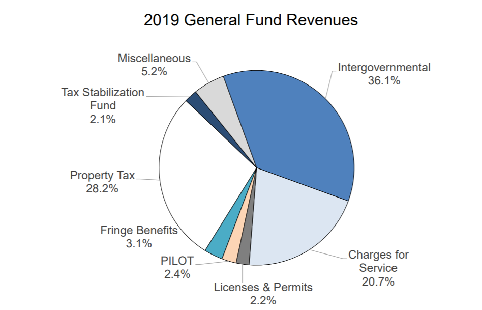
Charges for service, at 20.7%, consist of revenue collected through a bill, like a water bill. Some cities will call these enterprise funds. Intergovernmental funds, at 36.1%, comprise the single largest slice of the budget. It represents funding received from the state government of Wisconsin. Current trends suggest that this source of revenue will likely shrink in the future. Finally, property taxes comprise the second largest piece of the pie at 28.2%. With intergovernmental funds shrinking and little chance of collecting a local sales tax, Milwaukee will rely more and more on property taxes and charges for services. In this piece we will focus on property taxes and address charges for service in a later piece.
Put Your Budget on the Ground: Map It
Mapping property tax revenue should start with a total revenue or revenue per acre map, like the one below (to know the importance of mapping revenue over value, see this post). The map below illustrates how much property tax revenue per acre each lot in the city generates. The colors indicate which quantile the lots reside in. This map has ten quantiles (like rankings) of equal count. That means the lots have been arranged in order of revenue per acre and then categorized into 10 quantiles (e.g. sections, categories) with an equal number of parcels in each. Parcels colored dark purple reside in the lowest 10% of all revenue per acre values. Likewise, parcels colored dark red reside in the highest 10%.
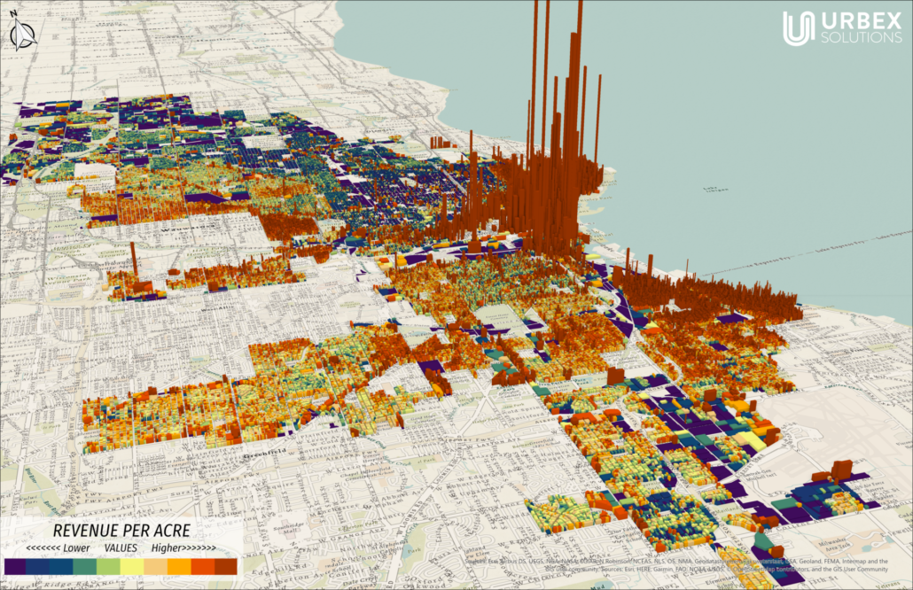
The extrusion (height) of the parcels illustrates the actual revenue per acre value. So, if one parcel is twice the height of an adjacent parcel, then it generates twice the revenue per acre. This type of symbology (color scheme & height) works well for geographic analysis. This map can help you understand which areas in the City of Milwaukee perform well and which don’t. This map could help you compare neighborhoods, zip codes, or districts. Incorporating demographic data can also offer us a powerful insight into the ethics of how cities fund themselves. It’s a great lens, and can lead to valuable insight. However, it’s not the only lens to look through.

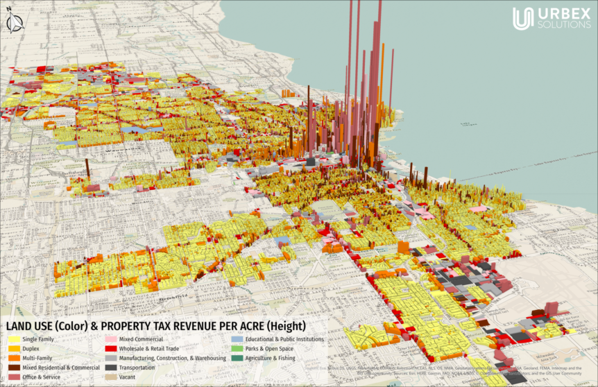
The above map illustrates a categorical view of the same property tax revenue per acre. The extrusion (height) still illustrates the revenue per acre values, but the colors now represent a land use classification. A categorical approach offers a different, but extremely valuable view of the revenue per acre patterns. This approach can help immensely if a city wants to know how its zoning districts, future land use categories, or development types perform financially. A city that wants to approach its development regulations as an investment portfolio (which is a good idea) needs to know about this way of analyzing itself.
Add Clarity & Detail to Your City’s Public Discourse
Below you’ll see some basic stats on the land use categories available in the City of Milwaukee’s 2018 property tax data. The bar chart shows how much revenue per acre each land use category generates on average. The top pie chart represents the proportion of land each land use category occupies across the city. The lower pie chart represents the proportion of the total revenue each land use category generates. The color in each chart represents the same land use category.
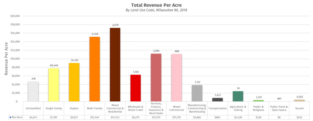
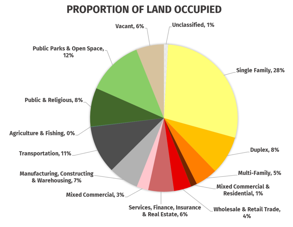
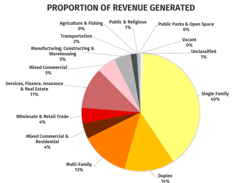
Charts like this can help a city begin to understand their development regulations as an investment portfolio. Take a look at Multi-family. As a land use it occupies 5% of the land, but generates 13% of the overall revenue. That’s a financially beneficial ratio for the city. In fact, all the residential and commercial land uses have similar ratios. The only land uses which have higher percentages in the occupied space chart than they do in the revenue chart are tax exempt, vacant, industrial, transportation, or agricultural.
With this kind of data available we can begin to address the following questions:
- Does your current city budget and capital improvement program allocate enough funds to install, maintain, and operate all the services and facilities citizens expect from the city?
- Does your city’s development portfolio consist primarily of high or low revenue generating types?
- What categories would you approve your city developing more of to create a higher revenue portfolio?
- How would you prefer your city address a shortfall in budgeting?
- Shift development patterns to have a greater proportion of high earning land uses?
- Increase the tax rates to accommodate a lower revenue land use pattern?
- Cut services and facilities?
- Create new funding structures outside of property taxes
- Some mixture of these options?
These questions set the stage for some great discussions with a higher level of detail. For instance, folks might want more high revenue land uses such as the “mixed commercial & residential” but only in certain forms or locations. They might support 4 stories or shorter along the commercial corridors outside of downtown. Or, maybe a city adamantly wants a portfolio with a 75% single family detached land uses, which generally has lower revenue potential, but they’re willing to enforce any form factors consistently found in the top 10% of that category. The revenue data allows for that type of deeper analysis. For example, the chart below organizes single family detached homes into lot size categories and shows revenue per acre and average improvement value per lot across those lot size categories.
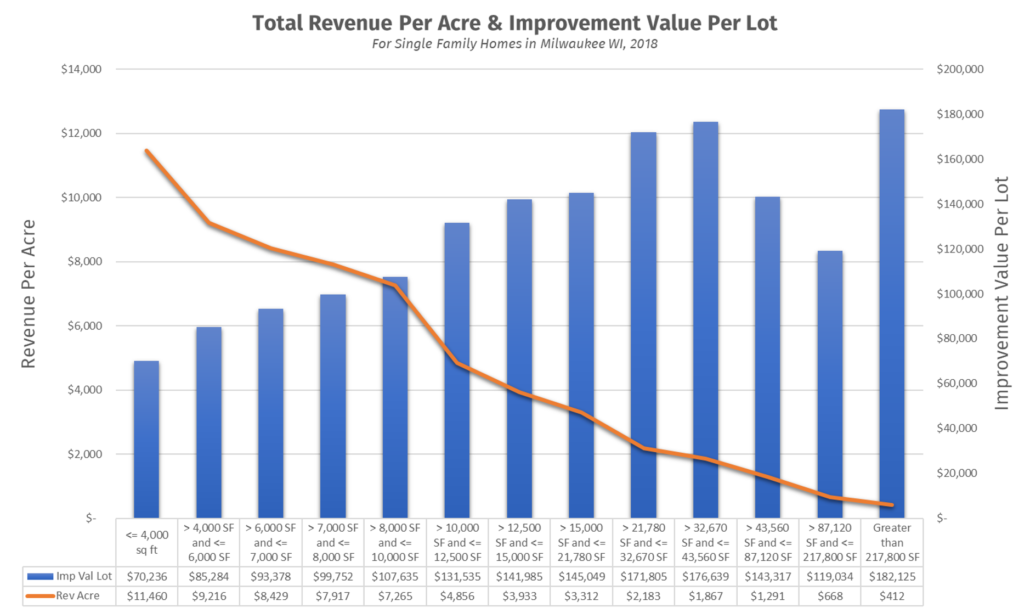
The charts shows that the revenue per acre (line) decreases as the lot size increases, despite an increasing average improvement value (bar). Bigger more expensive homes don’t necessarily translate into higher revenue performance. So, a higher performing single family detached portfolio might include a higher proportion of small lot single family detached homes to larger lots. That could lead directly to amending a city’s zoning and subdivision ordinance. We can take this type of analysis and discussion in an endless number of directions. Most importantly we need to know that this type of discussion is available, and a city has much to gain by getting it started.
Parting Thoughts
Keep in mind this data hasn’t even incorporated costs yet. The discussion reaches a whole new level of detail once a study incorporates costs into the equation. Return on investment and net revenue metrics of different geographies and categories become available. Additionally, adding cost data allows a city to run projections on whether their current trends or future development scenarios create a net positive or net negative financial future.
Much of life occurs deep in the nitty-gritty. That’s true for cities just as much as for people. One of our goals at Urbex Solutions is to help cities make sense of, communicate, and utilize its own data.